Small post-mortem for future me


I'm writing this post-mortem mostly for my future self, working on new game projects. I want to remember some of the mistakes I've made to avoid making them again. So let's start with mistakes:
MISTAKES
1. Decide early on how the text is going to be displayed and formatted
I knew Bitsy would be a bit of a pain to make a VN but I didn't take into account TEXT SIZE and FORMATTING. Understanding how pagebreaks work and testing the dialog box character limit should be the first thing to do, and I did it only when I had a script.
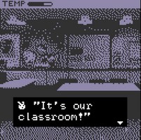
When I discovered how good CHUNKY TEXT looked I discovered that what I wrote looked bad and that having chunky text would encourage me to write short sentence, influencing also writing style, which is super cool. The idea would be to write a story in short phrases, like a haiku. I started doing it towards the end of development but it wasn't planned from the start, and that's a pity.
2. Be very precise with labeling scenes
This was a mess, I started labelling my scenes with Page1, Page2 ecc and then changed to scene3a, scene3b ecc, this was confusing to say the least, and looking for files was a pain. Not to mention that I sometime made mistake in spelling scene names (scene3a or scene 3 a ?). I still have to find a good naming scheme for this.
3. Reusing backgrounds is not good for bitsy
There were a lot of extra scenes that were cut because returning to previous location was confusing to me. This would be very easy in engines such as Renpy, but in Bitsy it's better to do all the writing in one location and then move on.
4. Make a test room!
What was cut
1. The TEMP system
Originally you could explore the school in order to find the room where the cold spot is, this feature was removed due to the issue with reusing backgrounds (see point 3 above).
2. Codex
Some words are in different colors, they are possible topics for a codex that never was.
What went right
In the end I really like the general look of the game. It was especially fun having the characters pics in the dialog box, I think that looks cool.
Backgrounds are also cool, probably a bit too noisy but that can be easily improved with more colors.
The use of sound is also as I intended, and I didn't encounter any difficult in implementing BitsyMuse hack this time (hint: use browser debug if something doesn't work)
Possible developments
I will definetely use this project as a template for future stories. I also want to try the same idea into Renpy, making some kind of "hd remaster".
Ghost School
The 1998 horror holiday special that never was
| Status | Released |
| Author | Wandering Artist |
| Genre | Visual Novel |
| Tags | Horror |
| Languages | English |
Leave a comment
Log in with itch.io to leave a comment.